
August 2026 Market Report

Photo by Joss Broward on Unsplash
Mortgage rates ended July near their highs for the year, taking some momentum out of homebuyer demand. But in San Francisco, sales have been driven more by wealth creation than by mortgage rates: the AI boom has spiked demand, especially for family-ready homes in specific neighborhoods.
That boom is concentrated in the city proper, with modest overflow onto the Peninsula. San Francisco's median sales price is up 25% year-over-year; San Mateo County is up nearly 10%. In the other eight Bay Area counties, price trends look much more like the country as a whole, essentially flat versus a year ago. We've included a map showing price changes across the region so you can compare how each area is faring.
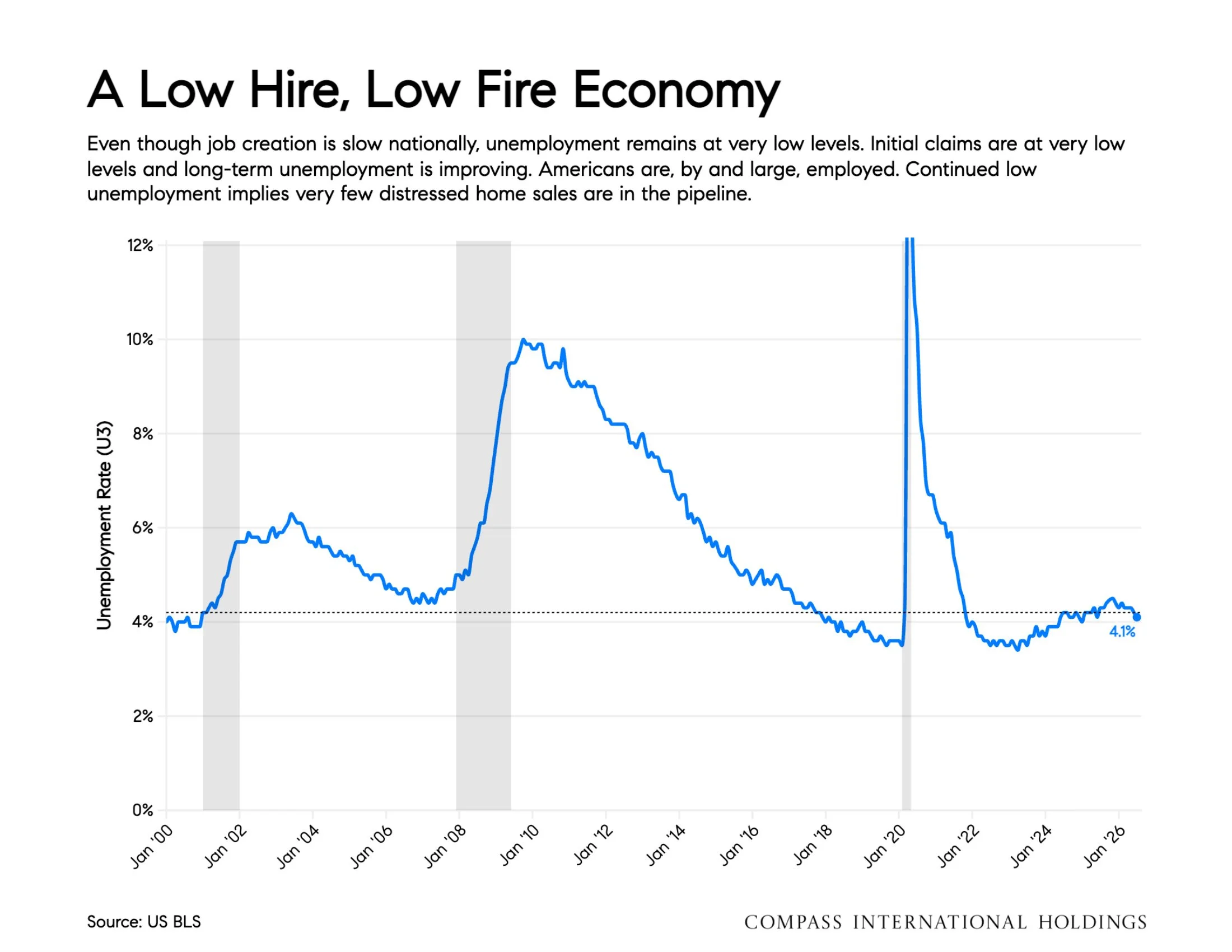
Rates remain elevated largely on inflation fears, with bonds under pressure from war-driven energy prices, tariffs, and unchecked government spending. What could bring rates down? A substantial slowdown in the labor market would ease some of that inflationary pressure. The U.S. labor market is already sluggish, and Northern California shows the same pattern: unemployment is low, but so is job creation. It's a low-hire, low-fire economy nationally.
Beyond rates, jobs matter directly for housing, since relocations for work are traditionally a major driver of demand. In the Bay Area, some AI companies are hiring fast, but the broader regional story is slightly fewer jobs in recent months. That divide shows up in housing: job creation in San Francisco is fueling demand there, while sluggish hiring elsewhere in the region means less.
The August 2026 overview: local markets are diverging from both the regional and national picture. Real estate is local, but the bigger picture still matters.
Source: Mortgage News Daily, Compass
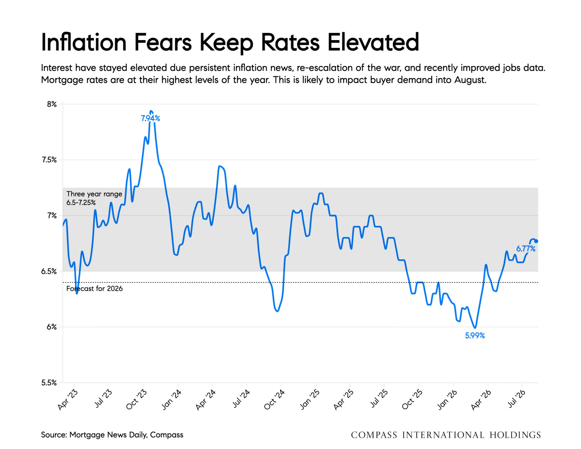
Interest rates have stayed elevated due persistent inflation news, re-escalation of the war, and recently improved jobs data. Mortgage rates are at their highest levels of the year. This is likely to impact buyer demand into August.
Source: US BLS, BEA
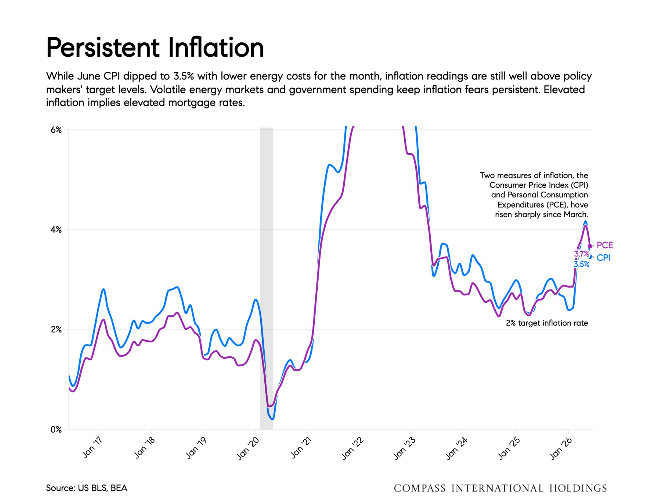
Two measures of inflation, the Consumer Price Index (CPI) and Personal Consumption Expenditures (PCE), have risen sharply since March. While June CPI dipped to 3.5% with lower energy costs for the month, inflation readings are still well above policy makers' target levels. Volatile energy markets and government spending keep inflation fears persistent. Elevated inflation implies elevated mortgage rates.
Source: US BLS, BEA
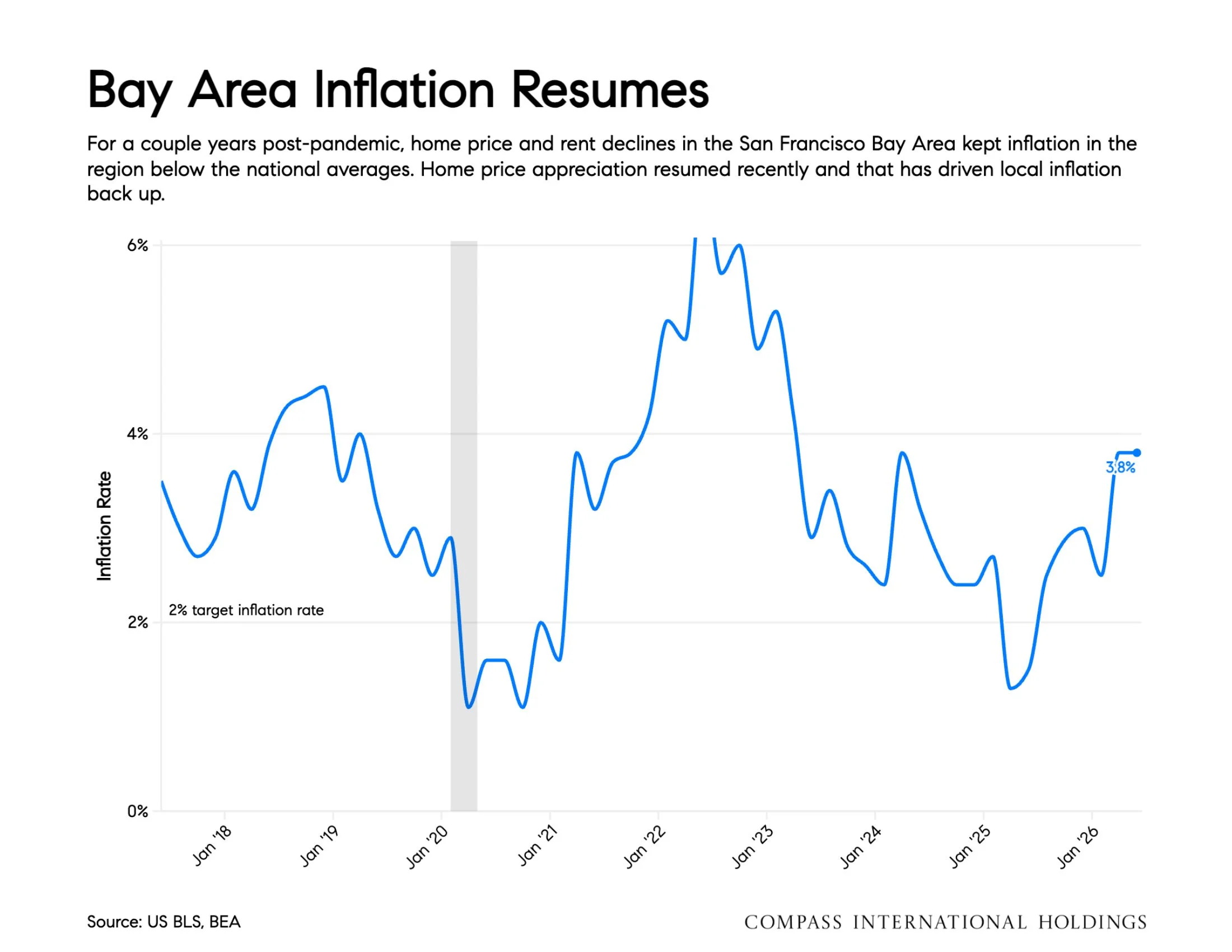
For a couple years post-pandemic, home price and rent declines in the San Francisco Bay Area kept inflation in the region below the national averages. Home price appreciation resumed recently and that has driven local inflation back up.
Source: BLS Non-Farm Payrolls, Total jobs. seasonally adjusted
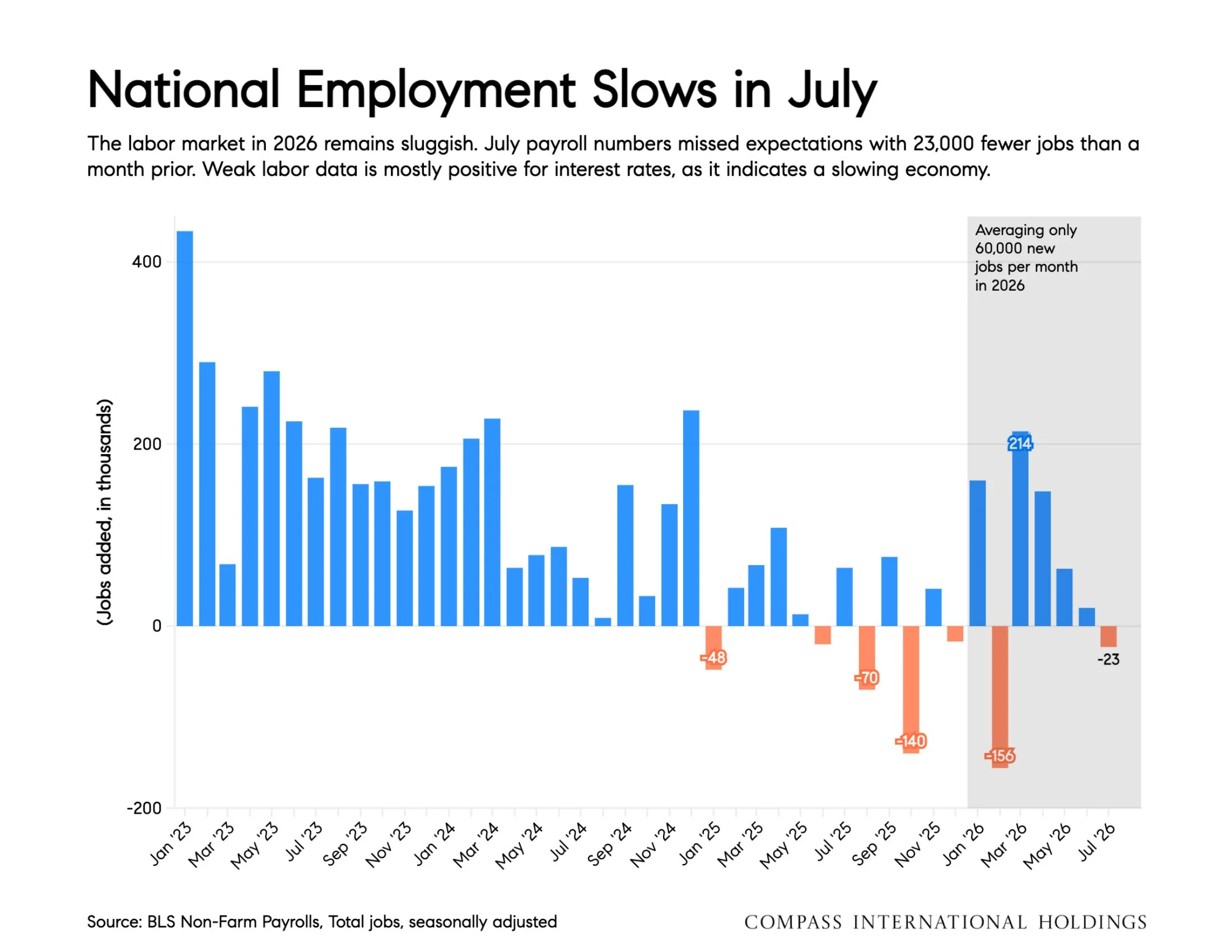
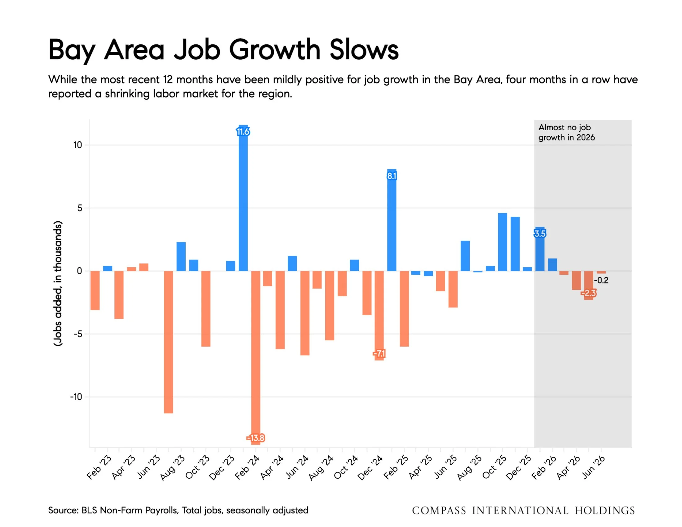
The labor market in 2026 remains sluggish. July payroll numbers missed expectations with 23,000 fewer jobs than a month prior. Weak labor data is mostly positive for interest rates, as it indicates a slowing economy.
Source: BLS Non-Farm Payrolls. Total jobs, seasonally adjusted
While the most recent 12 months have been mildly positive for job growth in the Bay Area, four months in a row have reported a shrinking labor market for the region.
Source: US BLS
Even though job creation is slow nationally, unemployment remains at very low levels. Initial claims are at very low levels and long-term unemployment is improving. Americans are, by and large, employed. Continued low unemployment implies very few distressed home sales are in the pipeline.
Source: MarketWatch.com Index change vs one year prior
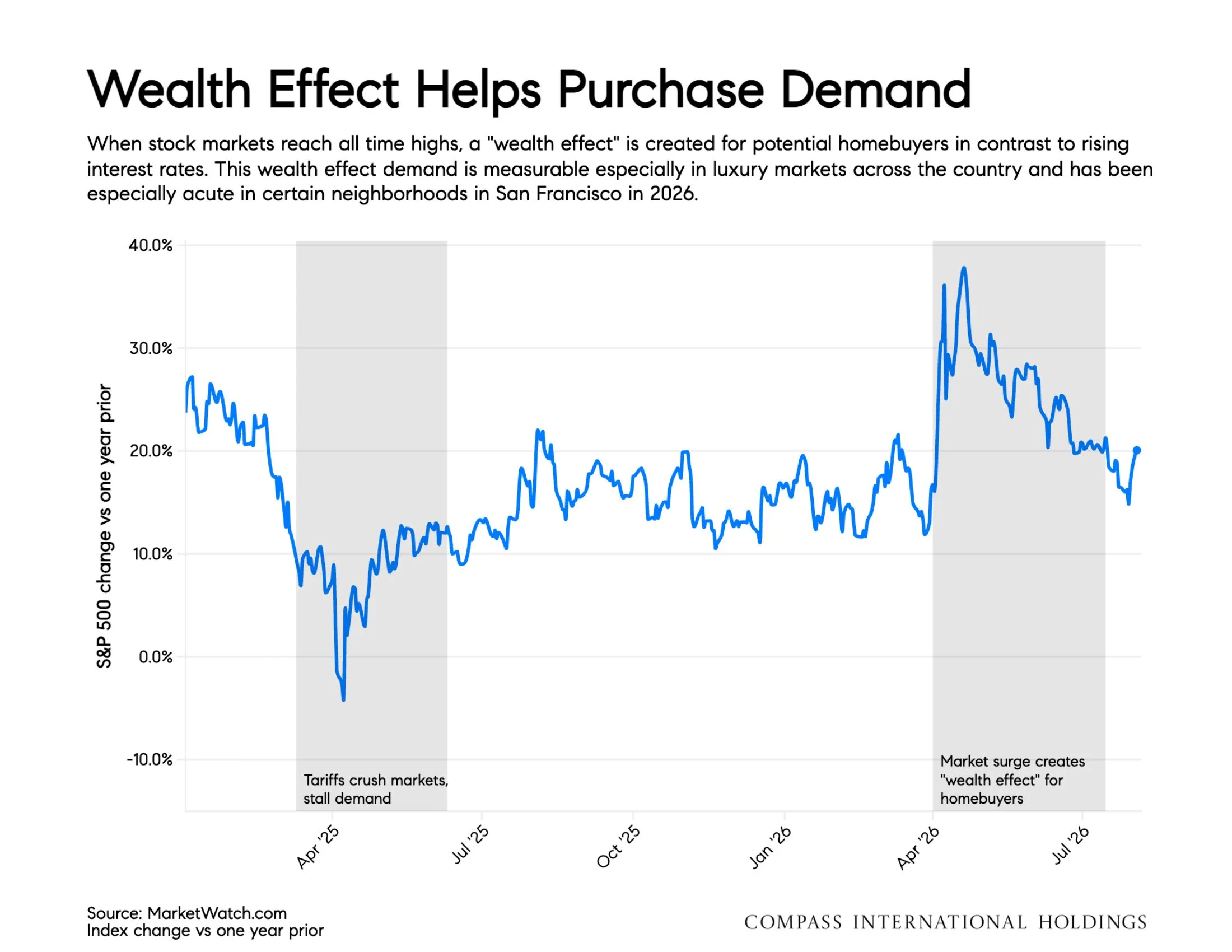
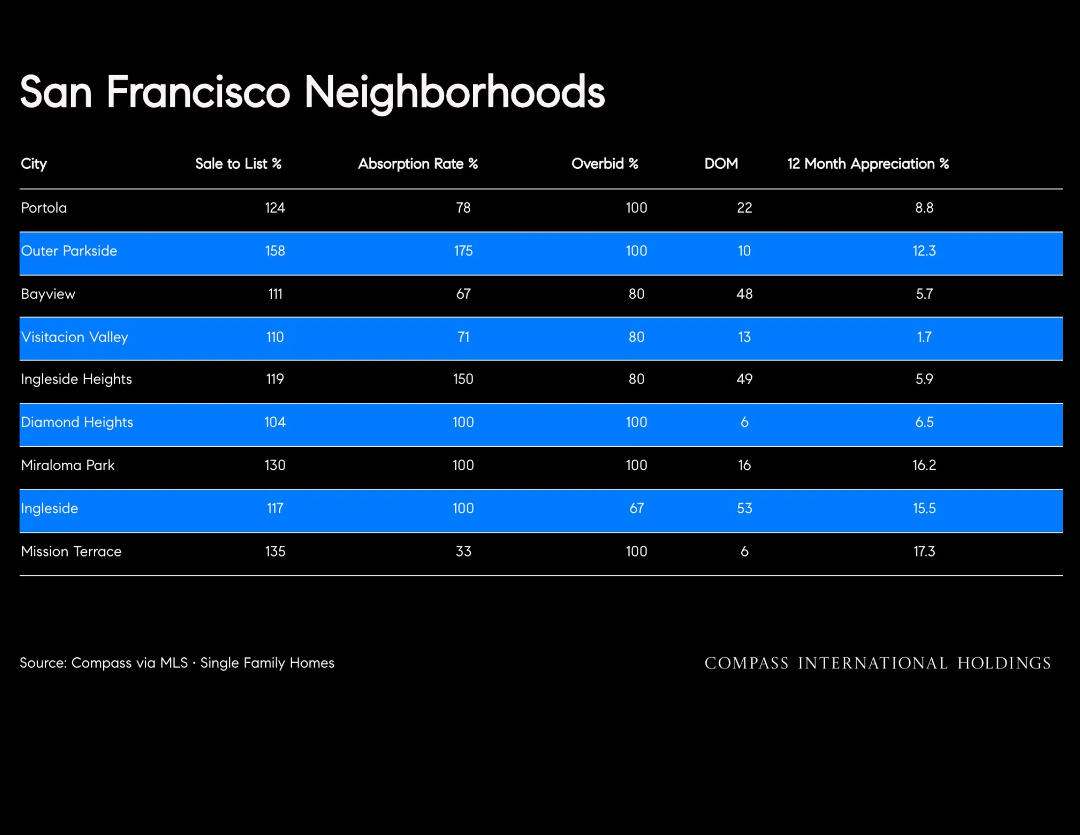
When stock markets reach all time highs, a "wealth effect" is created for potential homebuyers in contrast to rising interest rates. This wealth effect demand is measurable especially in luxury markets across the country and has been especially acute in certain neighborhoods in San Francisco in 2026.
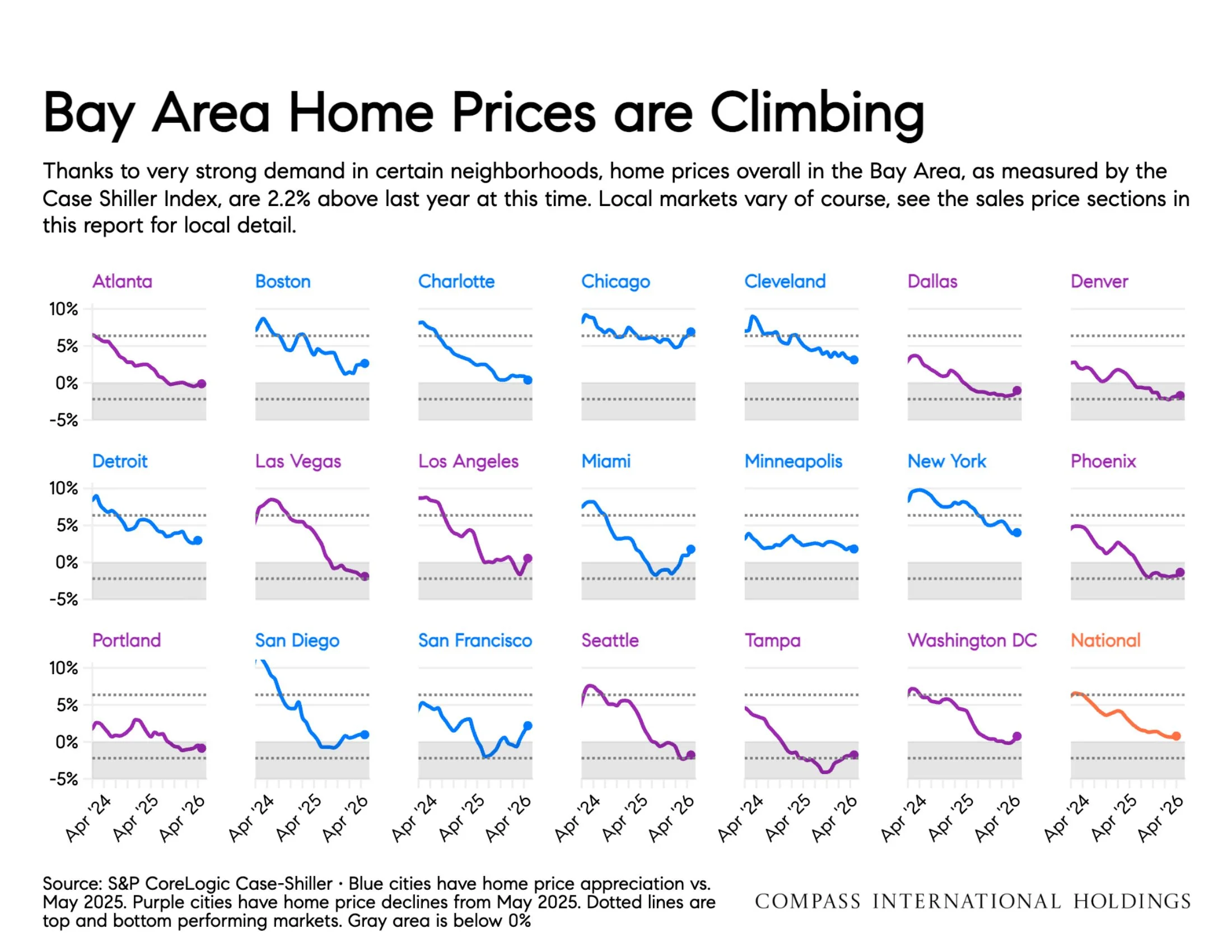
Source: S&P CoreLogic Case-Shiller· Blue cities have home price appreciation vs. May 2025. Purple cities have home price declines from May 2025. Dotted lines are top and bottom performing markets. Gray area is below 0%
Thanks to very strong demand in certain neighborhoods, home prices overall in the Bay Area, as measured by the Case Shiller Index, are 2.2% above last year at this time. Local markets vary of course, see the sales price sections in this report for local detail.
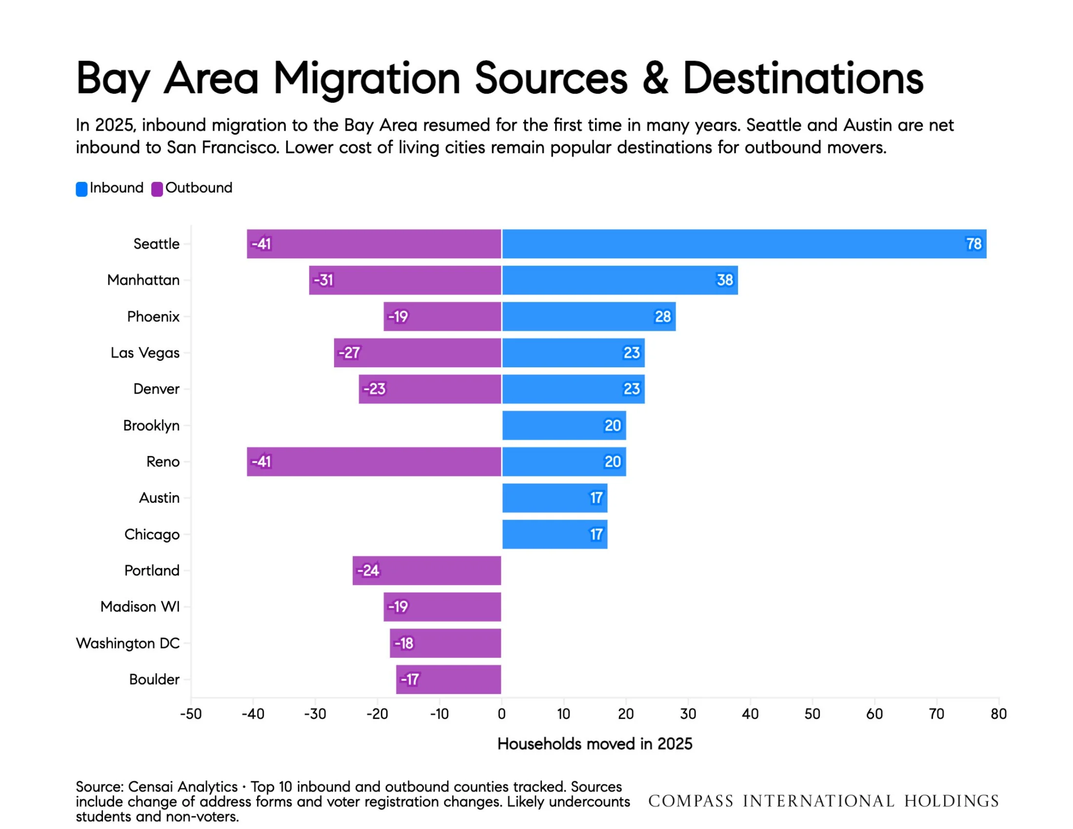
Source: Censai Analytics • Top 10 inbound and outbound counties tracked. Sources include change of address forms and voter registration changes. Likely undercounts COMPASS INTERNATIONAL HOLDINGS students and non-voters.
In 2025, inbound migration to the Bay Area resumed for the first time in many years. Seattle and Austin are net inbound to San Francisco. Lower cost of living cities remain popular destinations for outbound movers.

San Francisco Recap
Single-Family Homes
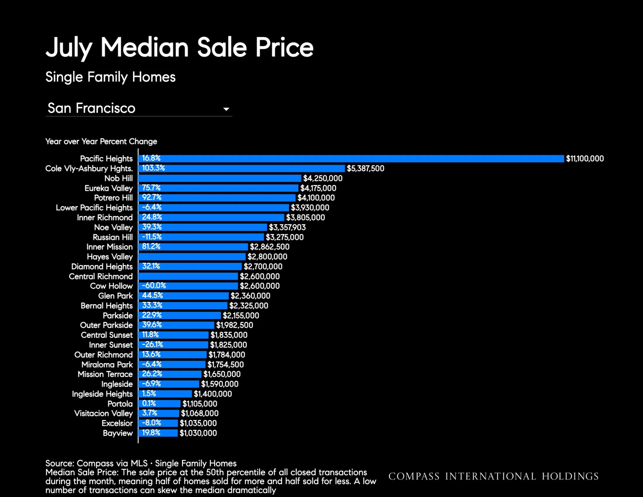
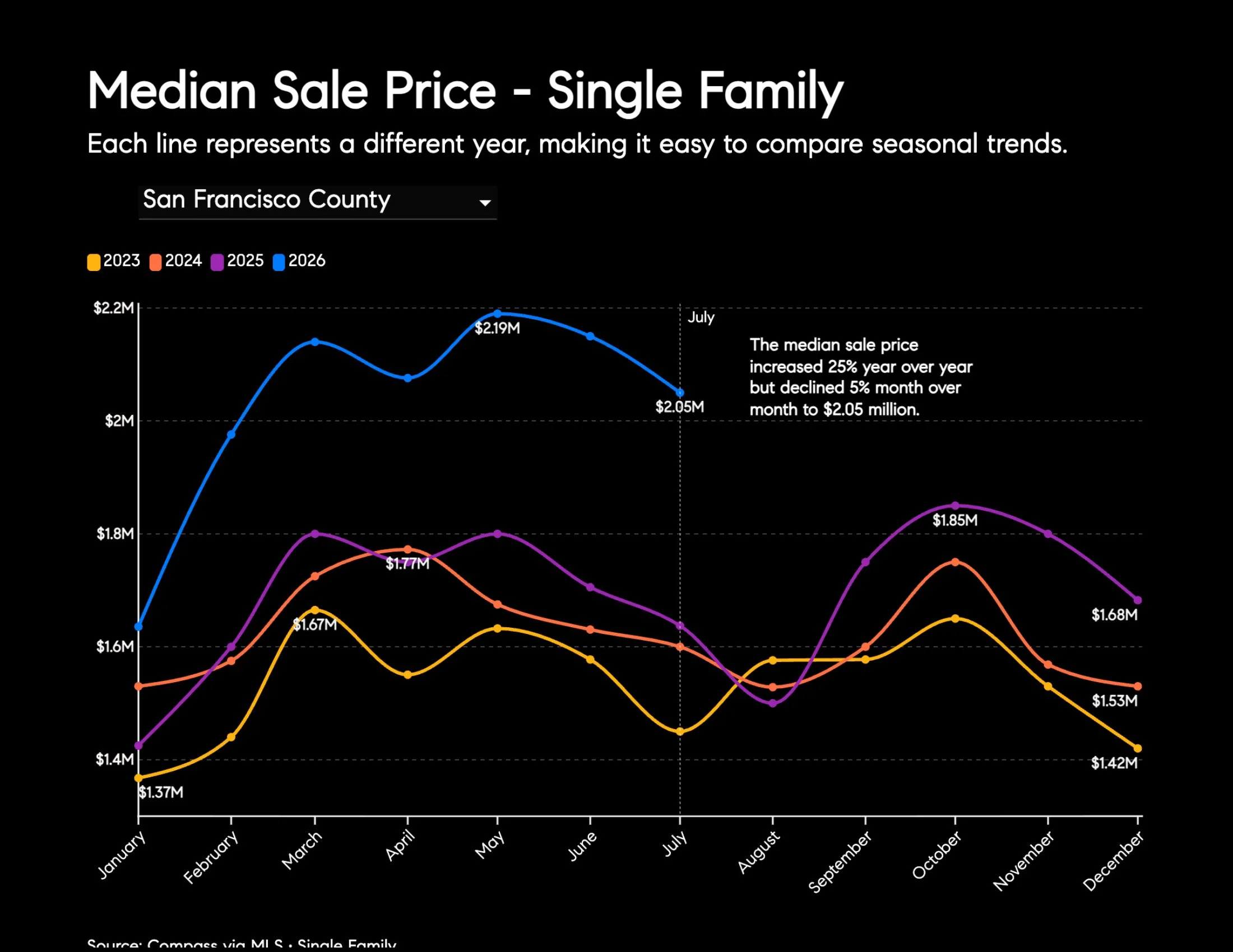
The median sale price increased 25.2% year over year but declined 4.7% month over month to $2.05 million.
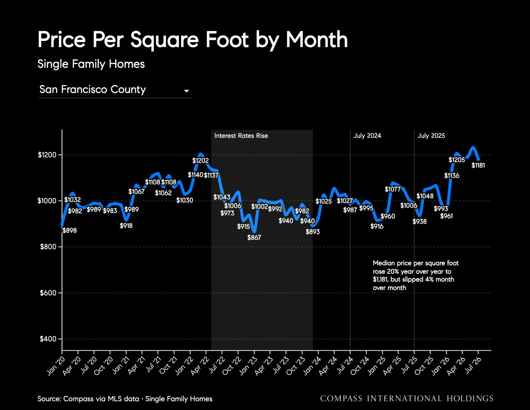
Median price per square foot rose 19.6% year over year to $1,181, but slipped 4.0% month over month.
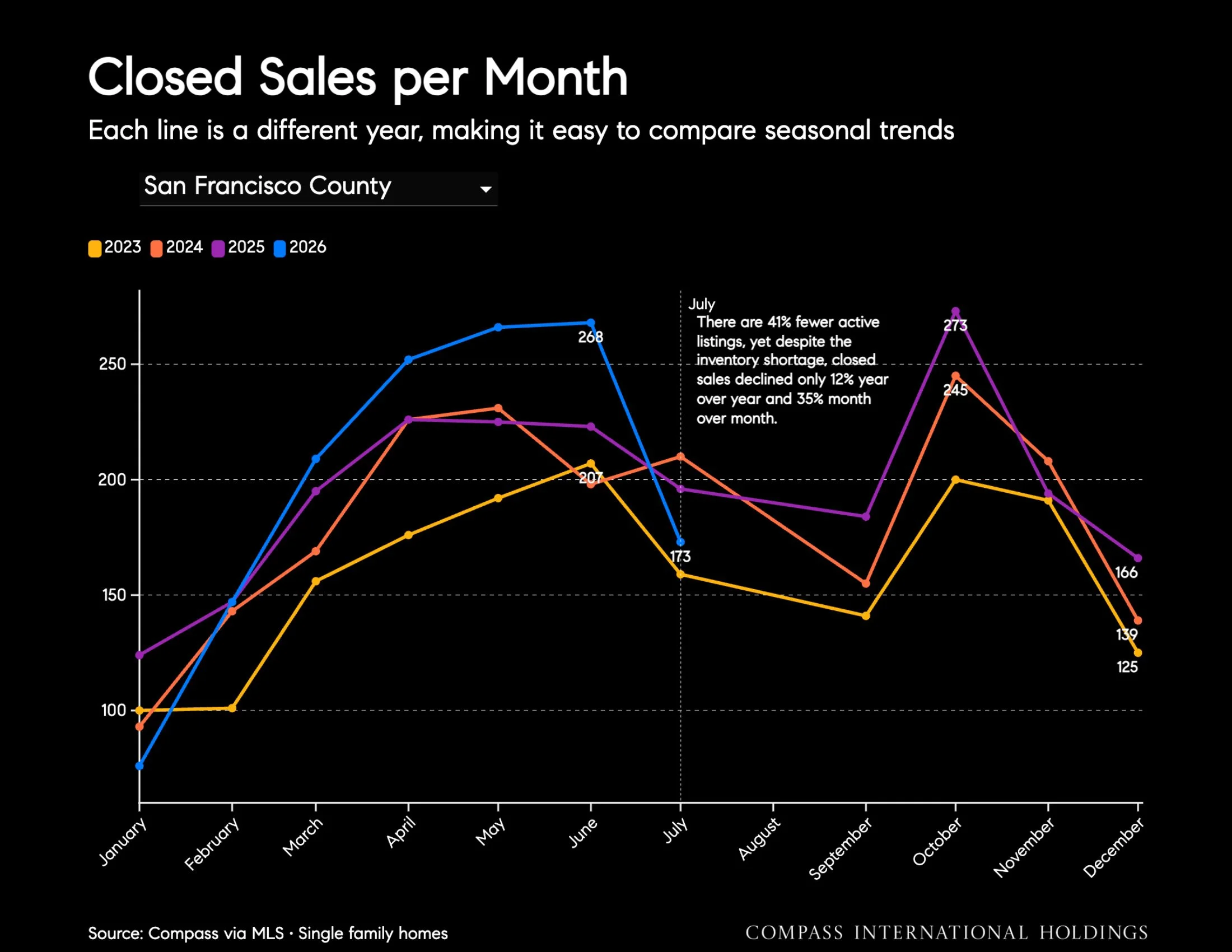
Closed sales declined 11.7% year over year and 35.4% month over month to 173 transactions, while pending sales fell 11.2% year over year and 32.7% from June to 150.
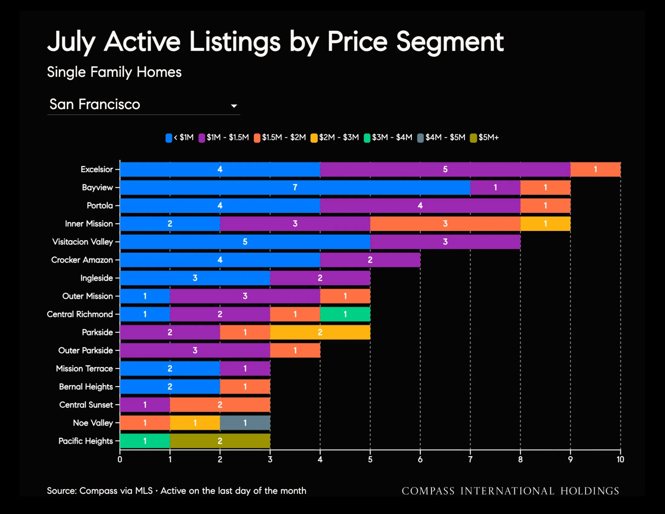
Inventory remained constrained, falling 40.9% year over year, though it increased 2.6% from last month to 156 active listings.
Average days on market declined 16.2% year over year but increased 32.1% month over month to 28 days.
Condominiums
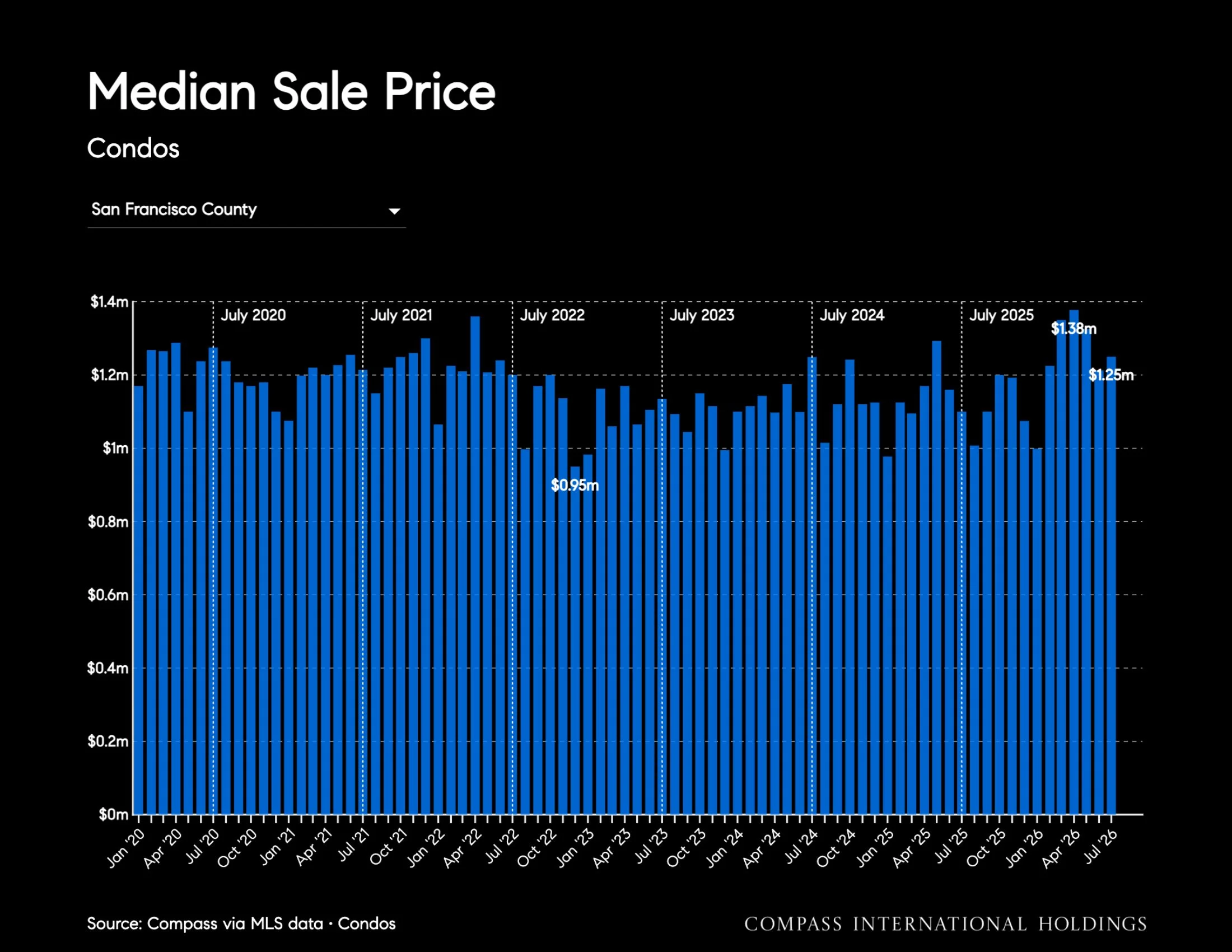
The median condo sale price increased 13.6% year over year and 3.1% month over month to $1.25 million.
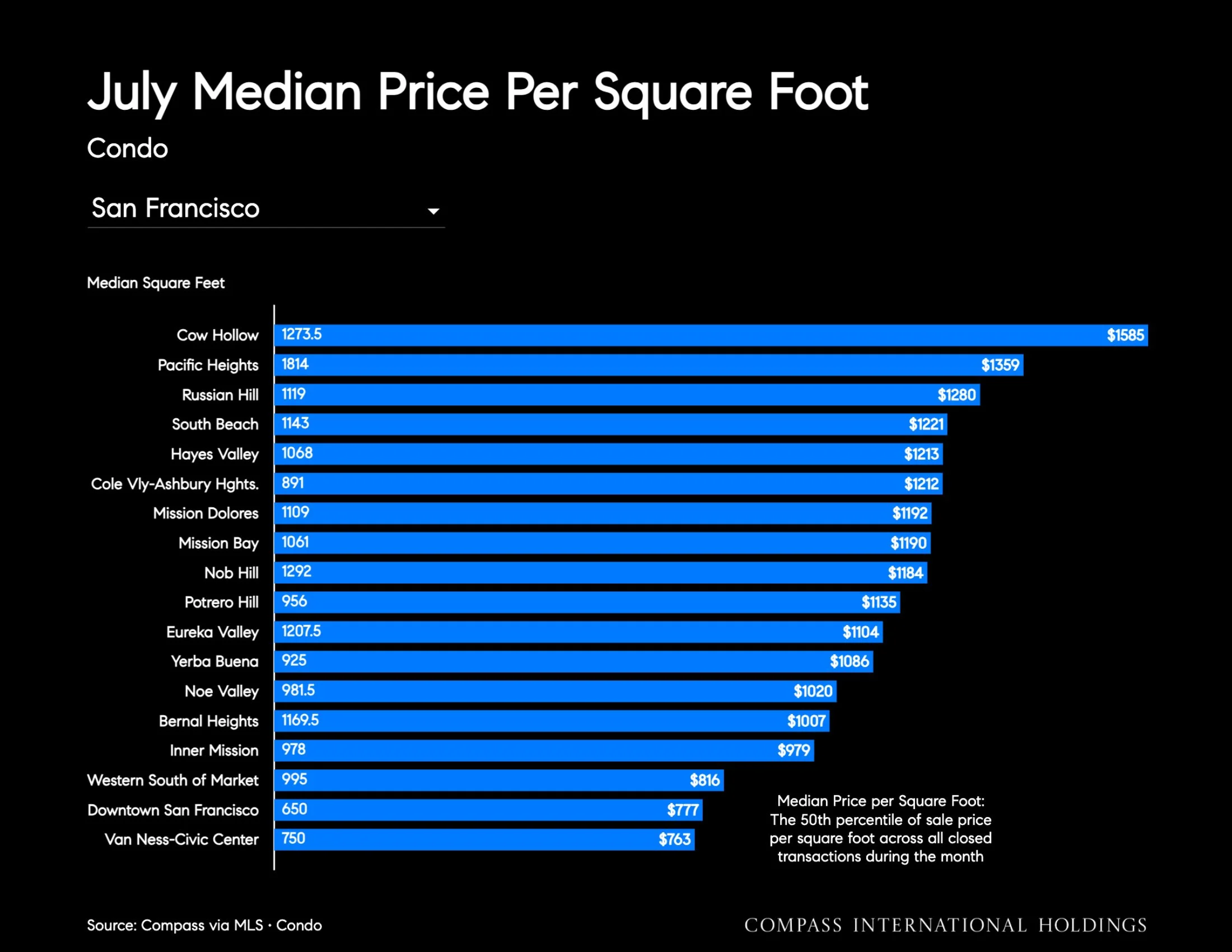
Median price per square foot rose 13.1% year over year to $1,103 but fell 2.1% month over month.
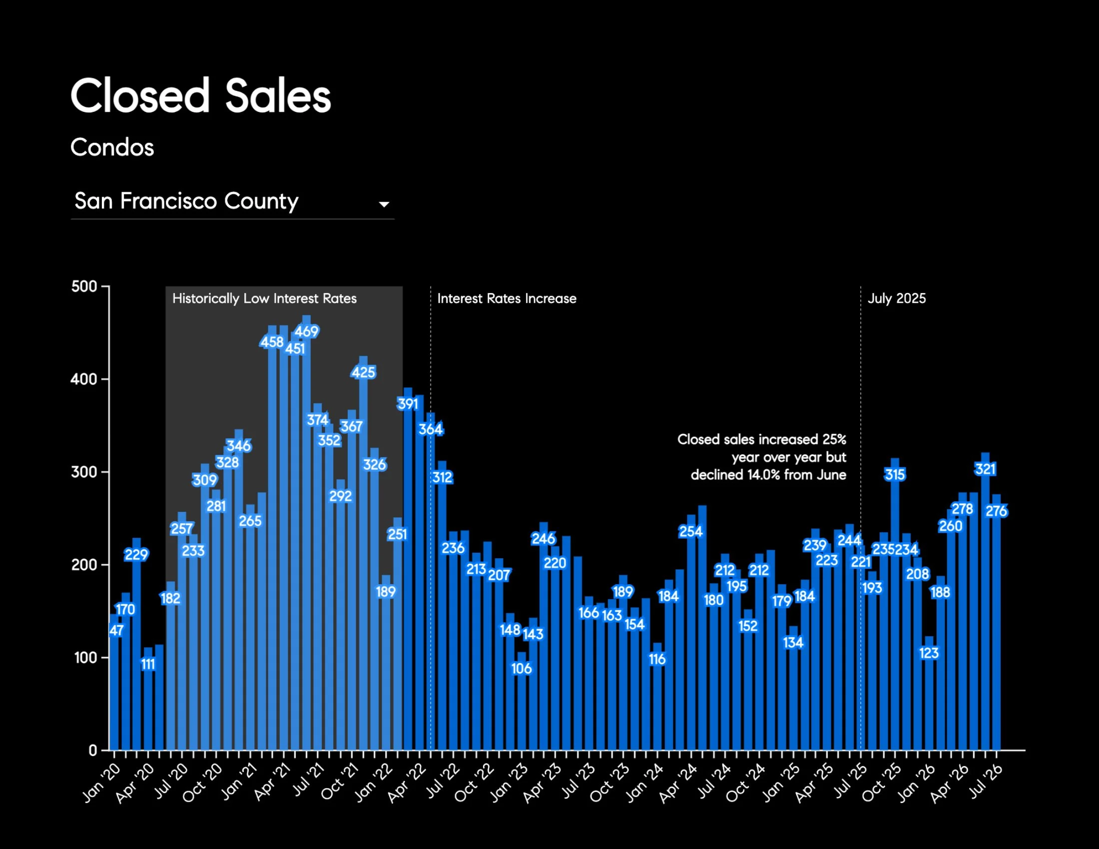
Closed sales increased 24.9% year over year but declined 14.0% from June to 276 transactions, while pending sales rose 15.7% year over year and fell 32.6% month over month to 221.
Inventory declined 42.5% year over year and 9.9% month over month to 417 listings.
Average days on market fell 38.0% year over year but rose 15.3% month over month to 43.3 days.
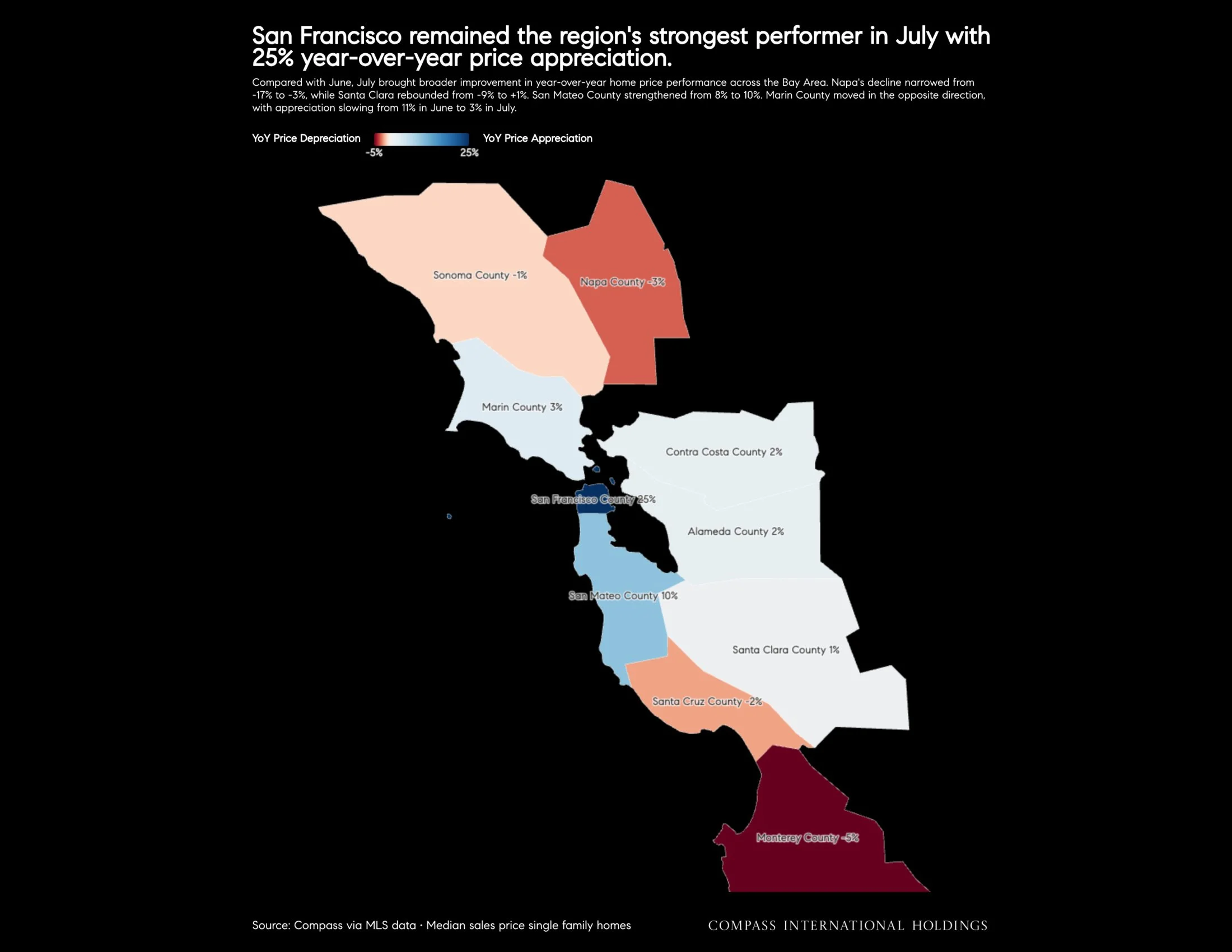
Source: Compass via MLS data • Median sales price single family homes
San Francisco remained the region's strongest performer in July with 25% year-over-year price appreciation.
Compared with June, July brought broader improvement in year-over-year home price performance across the Bay Area. Napa's decline narrowed from -17% to -3%, while Santa Clara rebounded from -9% to +1%. San Mateo County strengthened from 8% to 10%. Marin County moved in the opposite direction, with appreciation slowing from 11% in June to 3% in July.
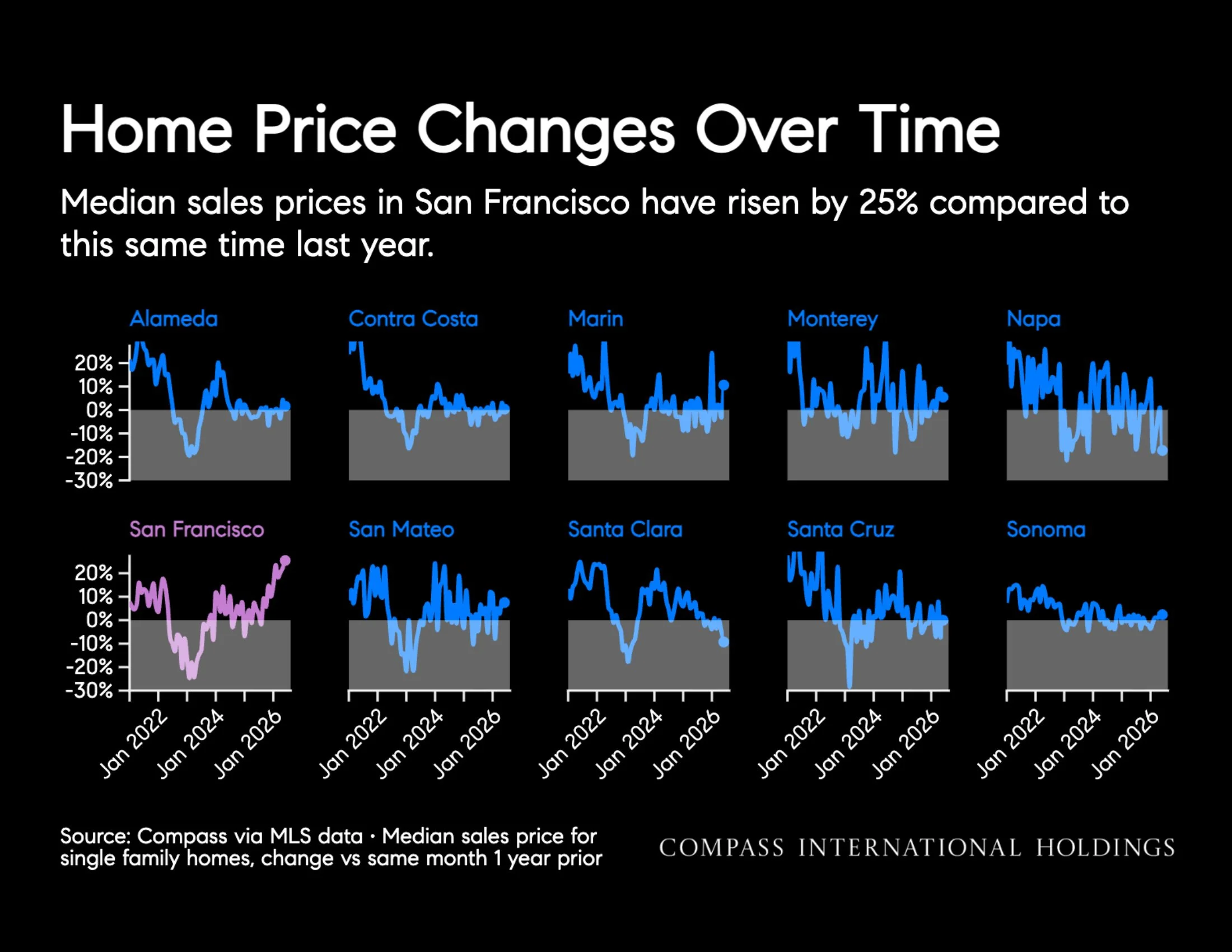
Source: Compass via MLS data • Median sales price for single family homes, change vs same month 1 year prior
Home Price Changes Over Time
Median sales prices in San Francisco have risen by 25% compared to this same time last year.
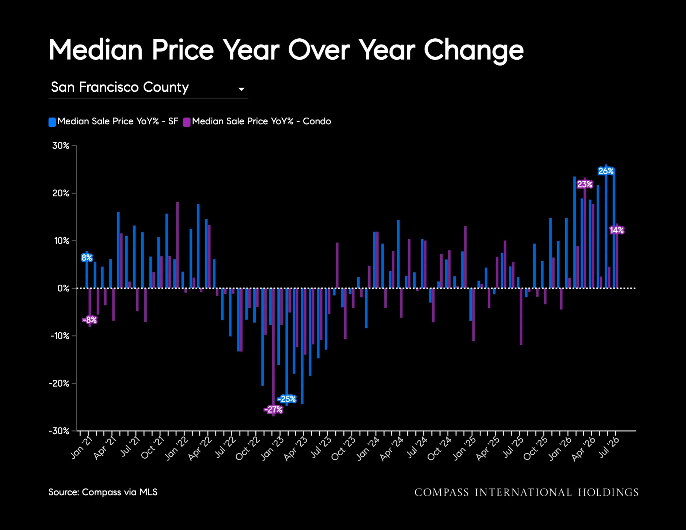
Source: Compass via MLS
Source: Compass via MLS • Single family homes
Closed Sales per Month
As of July, there were 41% fewer active listings, yet despite the inventory shortage, closed sales declined only 12% year over year and 35% month over month.
Source: Compass via MLS • Single Family Homes
Median Sale Price is the sale price at the 50th percentile of all closed transaction: during the month, meaning half of homes sold for more and half sold for less. A low number of transactions can skew the median dramatically.
Source: Compass via MLS - Single Family
Median Sale Price - Single Family
The median sale price increased 25% year over year but declined 5% month over month to $2.05 million.
Source: Compass via MLS • Single Family Homes
Source: Compass via MLS • Single Family Homes

Source: NorCal MLS
Percentage of Inventory Pending
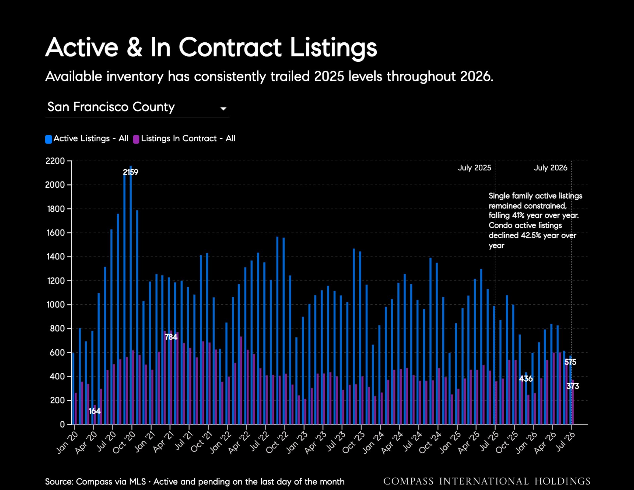
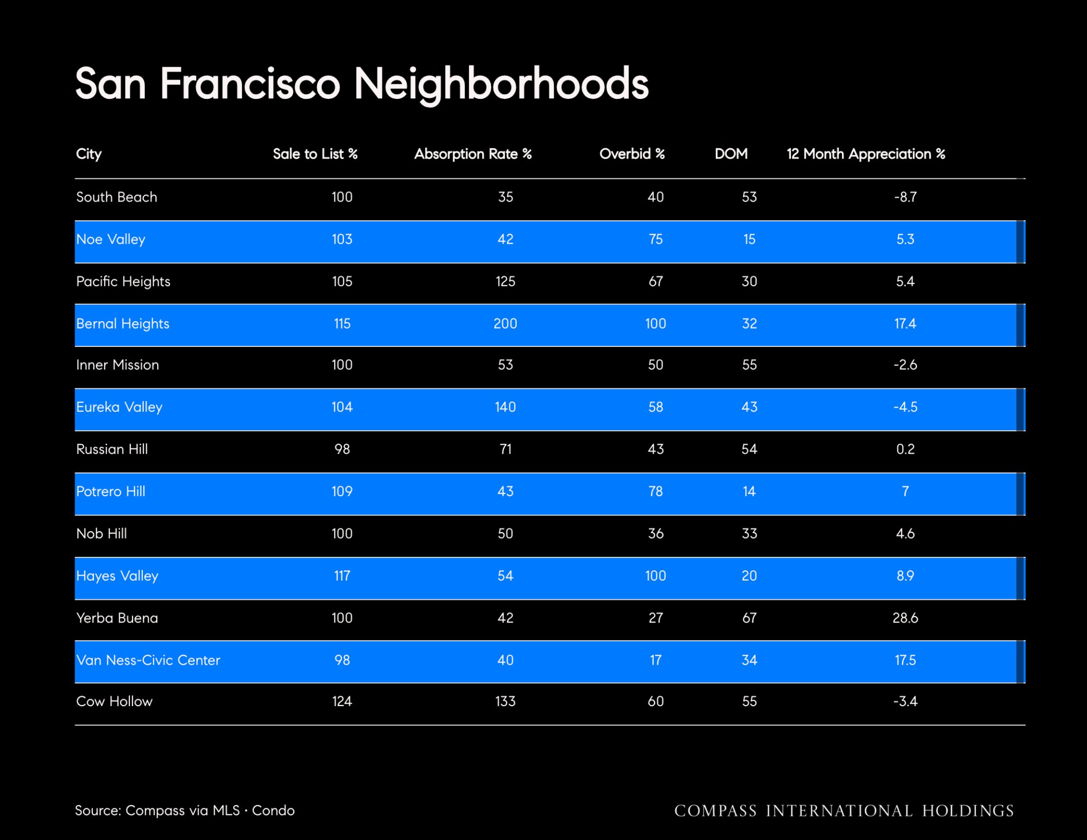
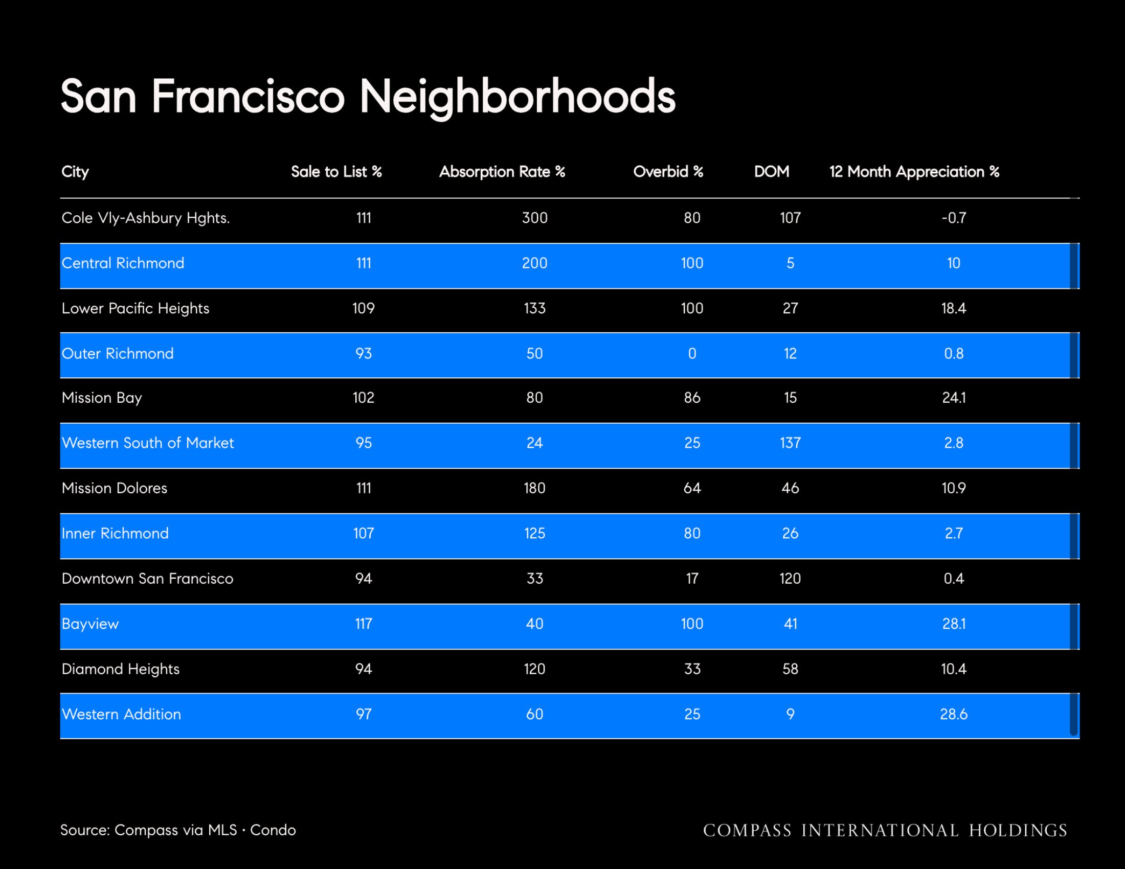
Absorption Rate: listings in contract divided by active listings; measures how quickly inventory is being absorbed.
Source: Compass via MLS • Active and pending on the last day of the month
Active & In Contract Listings
Available inventory has consistently trailed 2025 levels throughout 2026.
Single family active listings remained constrained, failing 41% year over year.
Condo active listings declined 42.5% year over year.
Source: Compass via MLS • Single Family Homes
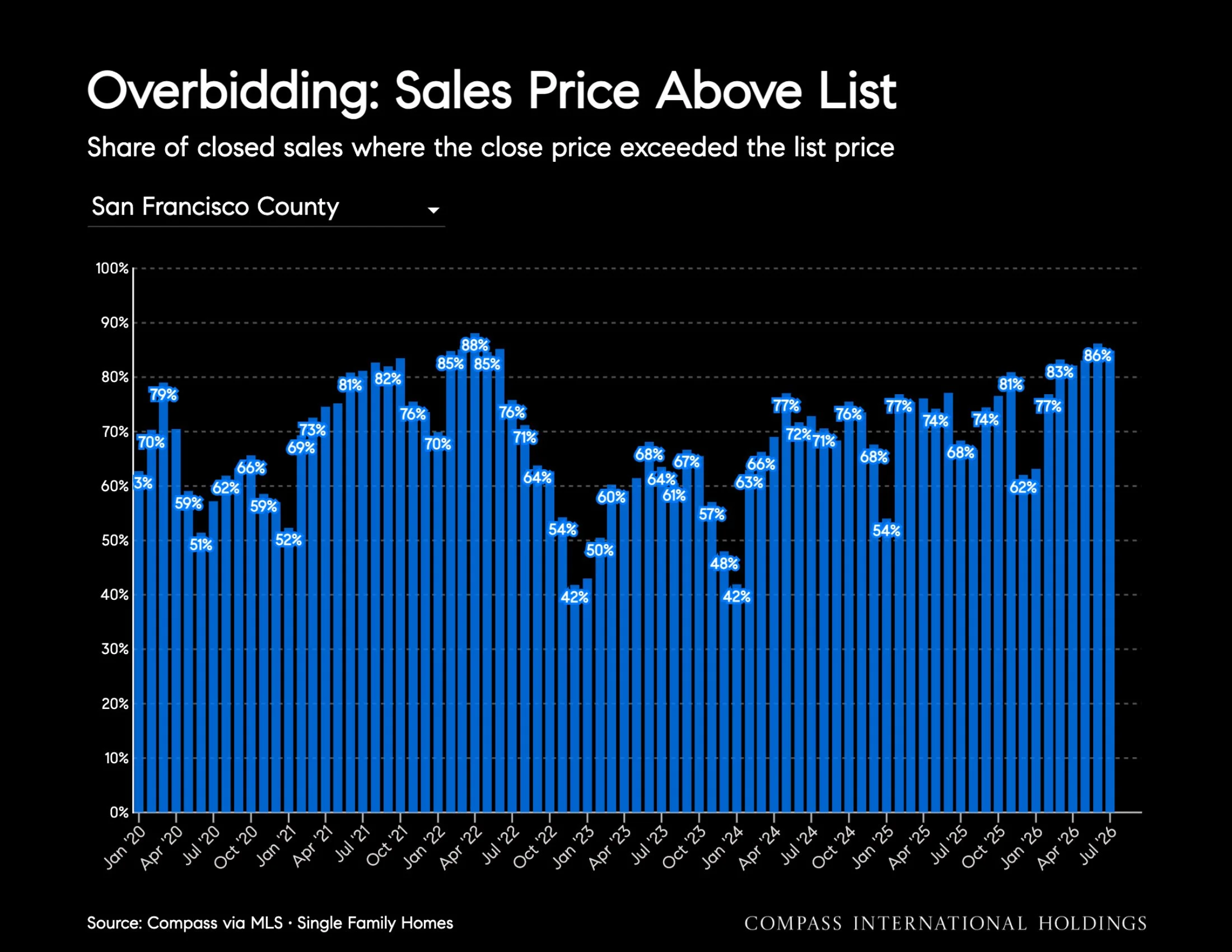
Overbidding: Sales Price Above List
Share of closed sales where the close price exceeded the list price
Source: Compass via MLS • Single Family Homes
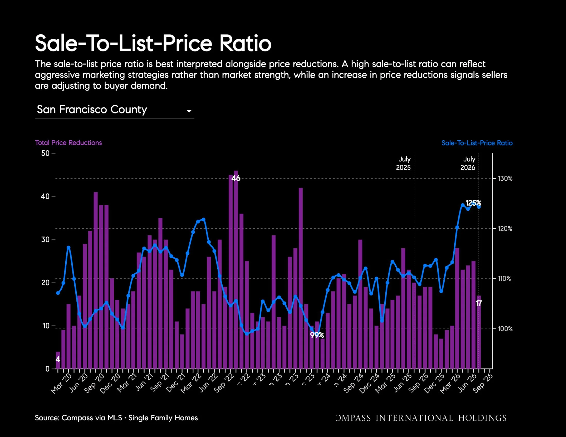
Sale-To-List-Price Ratio
The sale-to-list price ratio is best interpreted alongside price reductions. A high sale-to-list ratio can reflect aggressive marketing strategies rather than market strength, while an increase in price reductions signals sellers are adjusting to buyer demand
Source: Compass via MLS
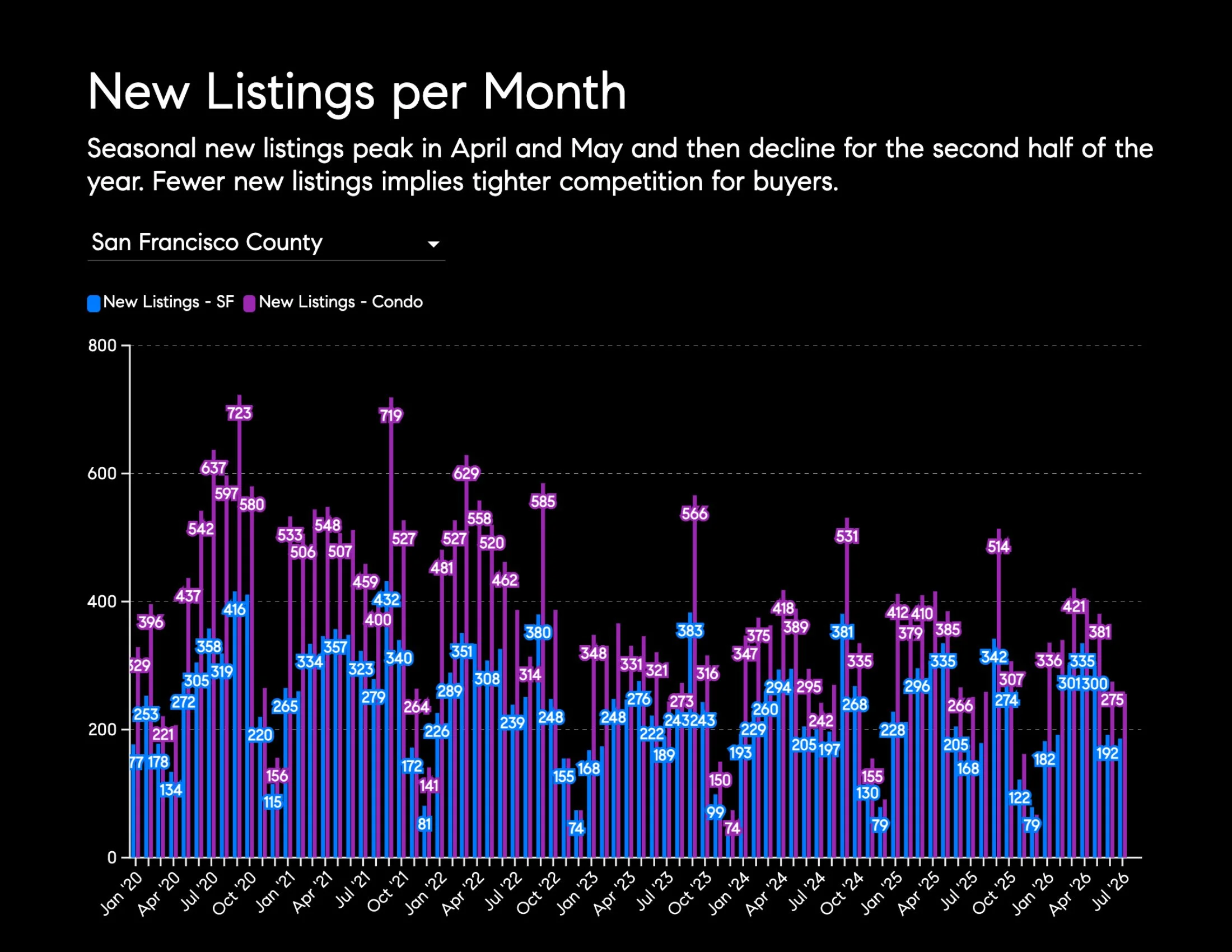
New Listings per Month
Seasonal new listings peak in April and May and then decline for the second half of the year. Fewer new listings implies tighter competition for buyers.
Source: Compass via MLS • Single Family Homes
Price Per Square Foot by Month
Median price per square foot rose 20% year over year to $1,181, but slipped 4% month over month
Source: Compass via MLS • Single Family Homes
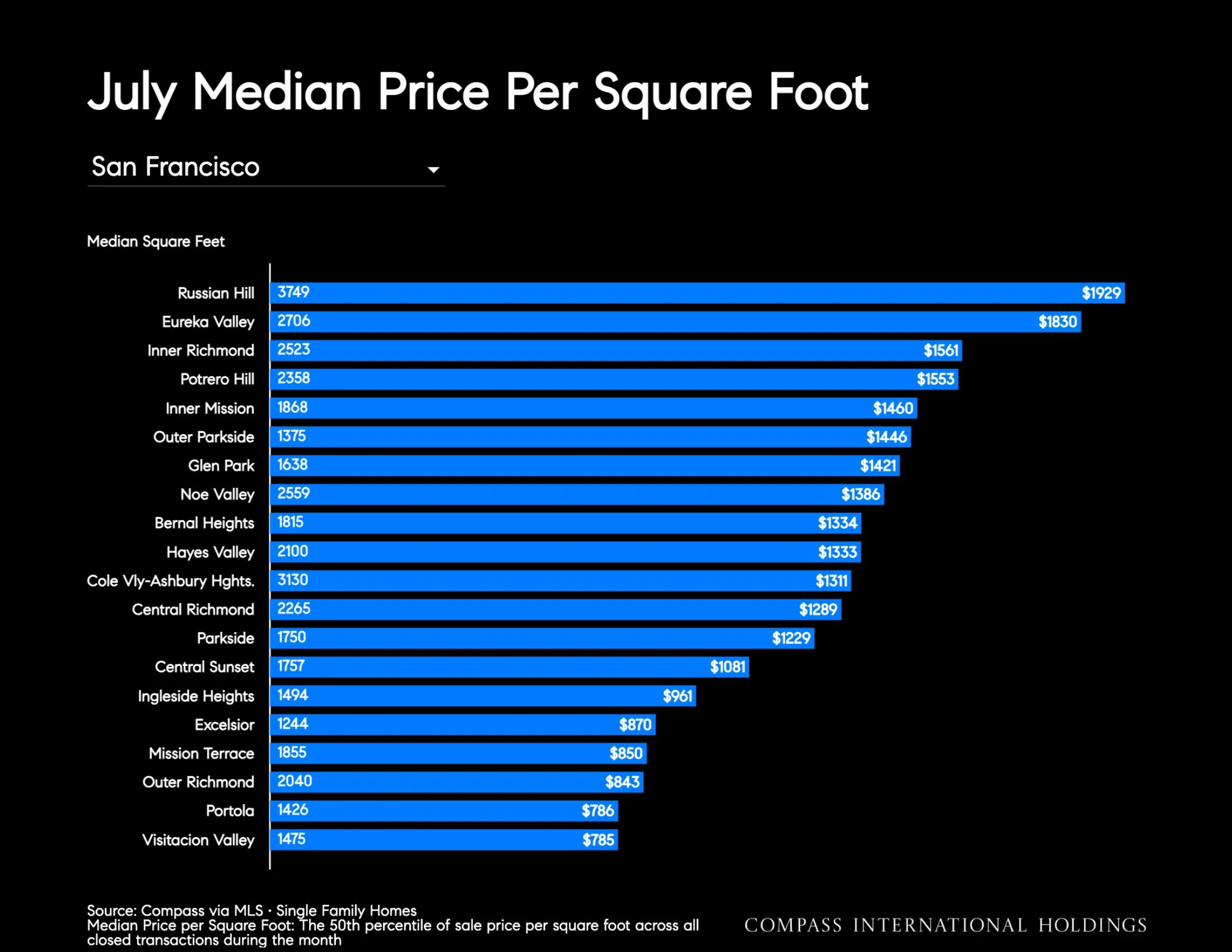
July Median Price Per Square Foot
Median Price per Square Foot: The 50th percentile of sale price per square foot across all closed transactions during the month.
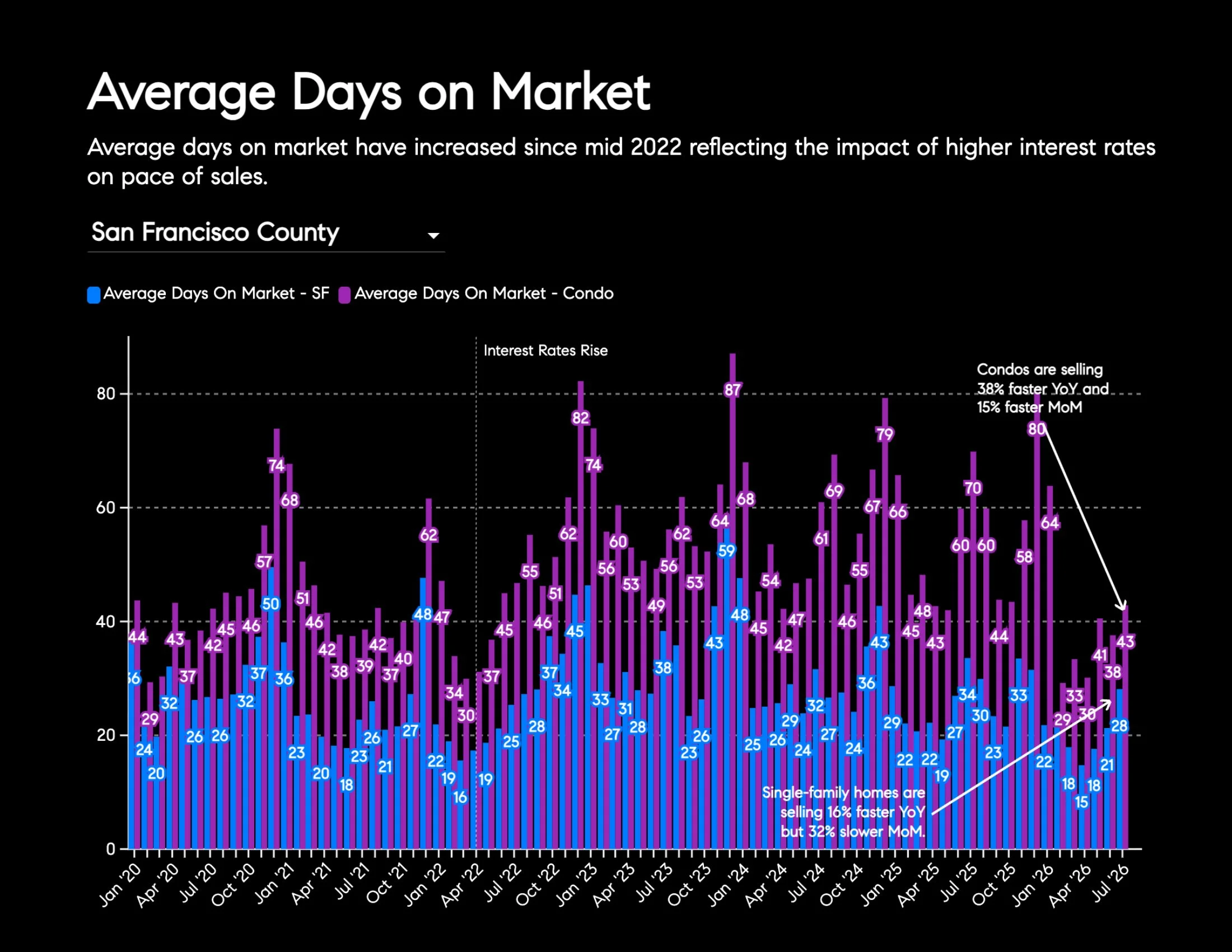
Average Days on Market
Average days on market have increased since mid 2022 reflecting the impact of higher interest rates on pace of sales.
Single-family homes are selling 16% faster YoY but 32% slower MoM.
Condos are selling 38% faster YoY and 15% faster MoM.
Source: Compass via MLS • Single Family Homes
Condos
Source: Compass via MLS data • Condos
Source: Compass via MLS data • Condos
Source: Compass via MLS data • Condos
Source: Compass via MLS data • Condos
Source: Compass via MLS data • Condos
Source: Compass via MLS data • Condos